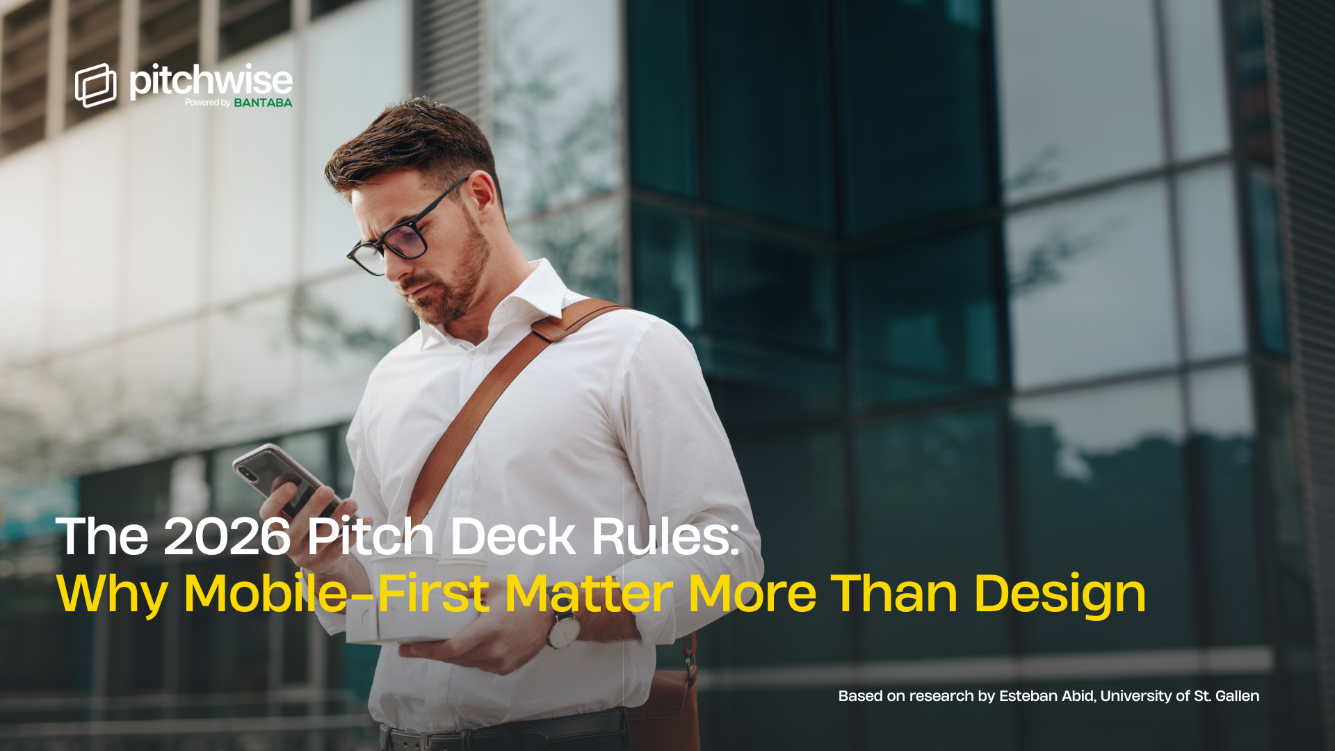
Your beautifully designed pitch deck just got rejected. Not because your idea was weak or your market wasn't big enough, but because the investor couldn't read it on their iPhone during their morning commute.
Over 70% of initial deck reviews now happen on mobile devices or tablets, yet most founders are still optimising their decks for conference room projectors. The fundraising game has fundamentally changed in 2025, and the old rules about font sizes and colour palettes are now secondary to how your deck performs in an investor's pocket. This shift isn't about following trends; it's about meeting investors where they actually are, which increasingly means meeting them on screens that fit in their hands.
The Mobile-First Revolution
Think about how investors actually work. They're not sitting in pristine conference rooms with your deck projected on a 60-inch screen. They're reviewing presentations on smartphones and tablets, requiring simplified slides, larger text, and easy scrolling capabilities. They're evaluating your company between meetings, on flights, in Ubers, at coffee shops, and during their daily commute. Your deck needs to work as well on a 6-inch screen as it does on a laptop, and if it doesn't, you're competing with one hand tied behind your back.
What does this actually look like in practice? The four mobile-first non-negotiables:
- Vertical, single-column layouts that reflow naturally on portrait-mode phones
- High-contrast colors that remain readable in bright sunlight or dim coffee shops
- Touch-friendly navigation where swiping feels natural, not frustrating
- Readable-without-zooming text with minimum 24-point fonts for body copy
If an investor needs to pinch and zoom to read your traction numbers, you've already created friction in the decision-making process. When an investor struggles with your deck format, they're not just annoyed; they're forming impressions about how you'll handle product development, customer experience, and operational excellence. Your deck is a proxy for your execution capabilities.
What Design Still Matters (And What Doesn't)
Let's be clear about the new hierarchy in 2026:
Critical:
- Mobile responsiveness
- Data freshness
- Clarity and simplicity
Important:
- Brand consistency
- Visual hierarchy
Nice to have:
- Visual polish and aesthetic refinement
Notice what's at the bottom of that list. Investors still value minimalist design with simplified slides that maintain attention while effectively communicating the business opportunity, and they prefer concise decks focusing on 10-15 slides instead of overwhelming presentations with 30-plus slides.
The fundamentals of clear, data-backed storytelling that connects emotionally haven't changed. Your brand should still be consistent. Your visual hierarchy should still guide the eye. But if you're agonising over whether to use a gradient background or debating between two shades of blue while your deck crashes on an iPhone, you're optimising for the wrong thing.
The Pitchwise Advantage
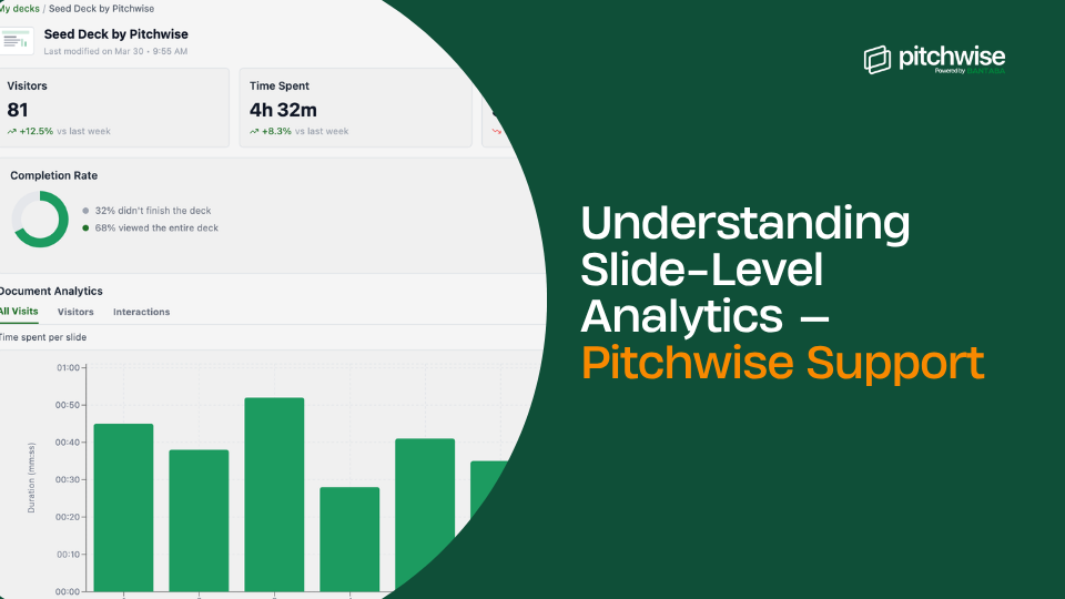
Most founders still design decks without knowing how investors actually interact with them. Recent analysis shows that Investors spend an average of 2 minutes and 15 seconds per deck, which means you have very few minutes to convey your key messages.
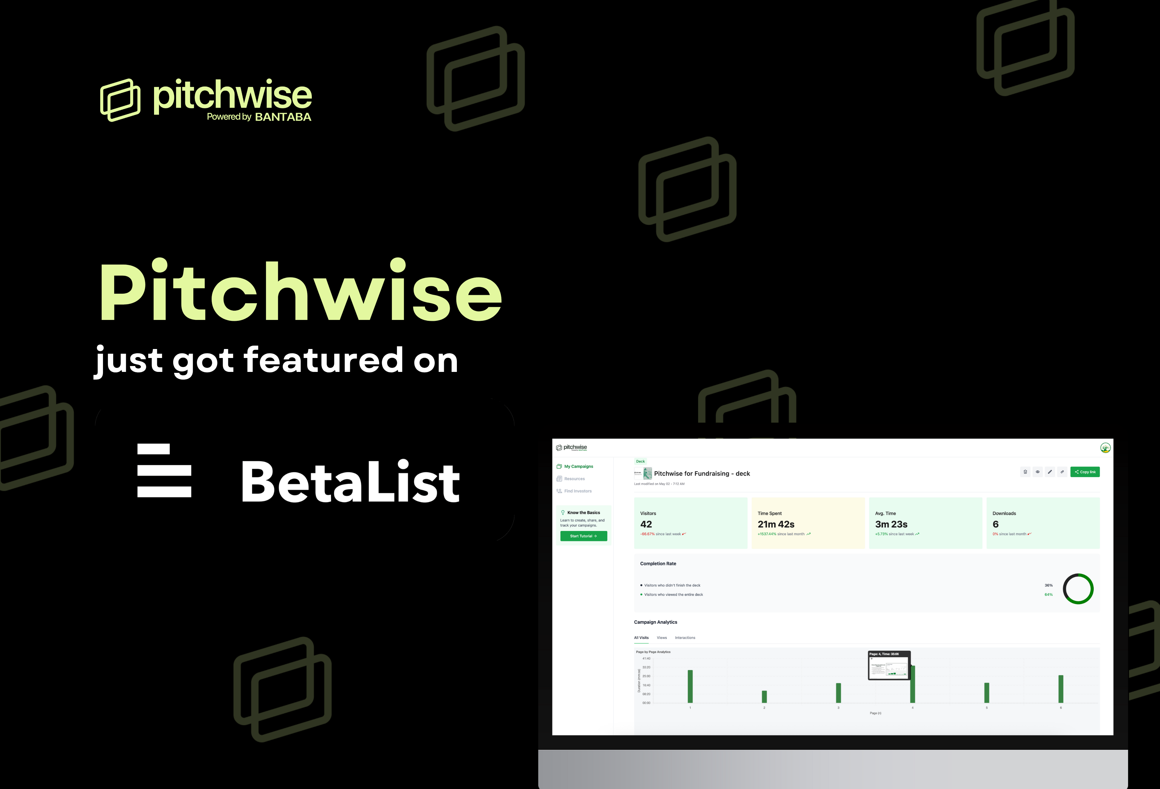
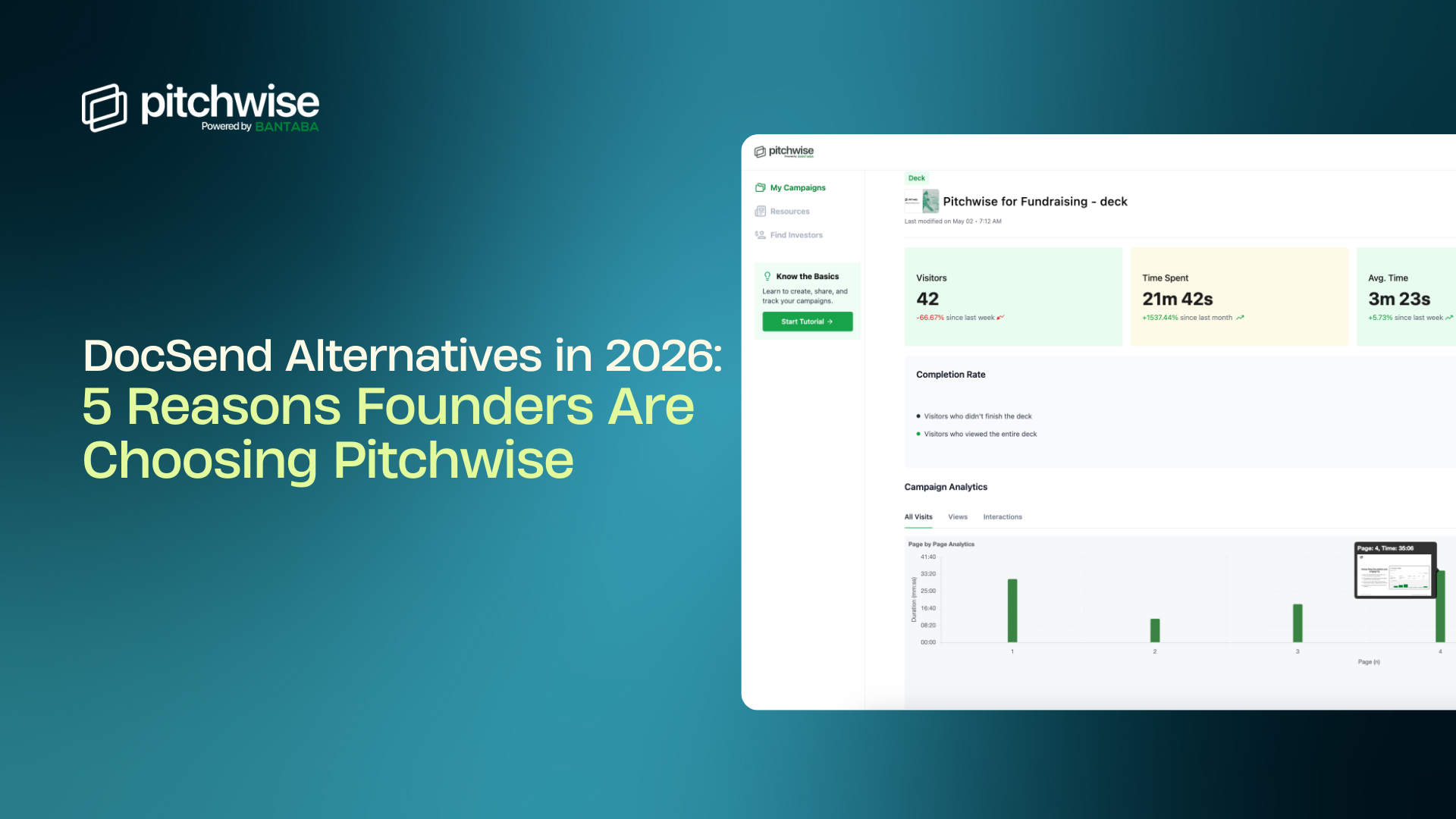
When you can see which slides investors spend the most time on, where they drop off, how many times they revisit specific sections, and whether they're viewing on mobile or desktop, you stop guessing and start knowing. This data changes everything about how you structure your deck. Pitchwise allows you to understand how investors are actually engaging with your deck; you can share via link instead of attachment, so you control versions and get visibility into viewership—insights that help you refine your pitch before your next big meeting.
The Consistency Principle
Here's the meta principle that ties all of this together: the rules of 2026 demand responsiveness and a clear story. The beautiful irony is that by obsessing less over visual design and more over mobile responsiveness and data freshness, you'll probably end up with a better-looking deck anyway.
Simplicity works on mobile. Clarity scales across devices. Real data is more compelling than the fanciest chart design. The constraints of the 2026 environment push you toward better fundamentals, which is exactly where you should have been focusing all along.























.png)








.png)




.png)




.png)




.png)

.png)


