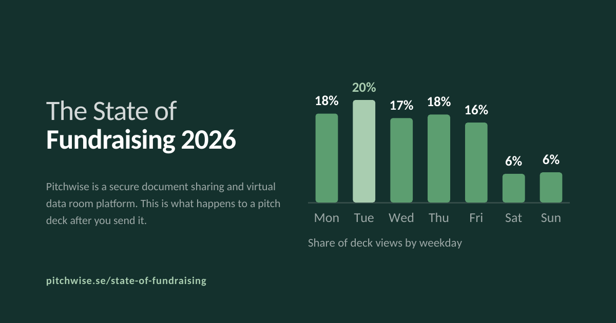
Most fundraising data comes from surveys, what founders and investors say they do. We wanted to know what they actually do, so we went through our own platform records instead.
The State of Fundraising 2026 is out today. It covers 1,384 pitch decks and data rooms shared on Pitchwise, opened 38,830 times by 14,438 viewers across 106 countries. It is free, there is no paywall, and every figure in it is quotable with attribution.
The question we started with
There is a lot of published advice about how to build a pitch deck and almost none about what happens to it after you hit send. Who opens it. From where. For how long. Whether it gets forwarded. Whether the second person to read it is the one who matters.
That information exists, it just sits inside document analytics, not in survey responses. So we aggregated over a year of it.
What we found
Four things stood out.
Attention is concentrated, not global. Decks on the platform were opened in 106 countries, which makes fundraising look worldwide. It isn't. A single country accounts for more deck views than the other 105 combined.
The pitch deck has become a controlled document. Most links require an email address before they open, and the overwhelming majority block downloads entirely. Founders will let you look. They won't let you keep a copy.
You get about a minute of real attention. The average viewing session runs 126 seconds, but the median is 66. We wrote separately about why that gap is the actual finding and what it means for how you build a deck.
The headlines describe a different market. The overwhelming majority of raises in the data are pre-seed or seed, at target sizes far below the numbers that make the news.
How it was built
Everything in the report is behavioural. No survey, no panel, no self-reported estimates except where explicitly labelled as such. The figures come from platform records over a defined window, and the methodology section states the population, the time period and the limitations of every number.
That section is longer than we would like and we published it anyway. A data report that doesn't show its working is an advert.
What we left out
More of the work went into deciding what we couldn't say than what we could.
We had figures that turned out to be measured on a different population than we assumed, so we recalculated them. We had a section that leaned on a source harder than the source supported, so we cut it. We had a headline number that was an average when the median told a more honest story, so we published both.
None of that is in the report. What's in the report is what survived.
Using it
The report is free and open. If a figure is useful to you, take it, all we ask is attribution to Pitchwise with a link. Journalists and analysts who want the underlying charts can pull them straight from the report page.
We would rather this got argued with than ignored. If your own numbers look nothing like ours, we want to hear about it, that is more interesting than agreement, and it makes the next edition better.
Read The State of Fundraising 2026